tanzania times : Latest News and In-depth Analysis
Contact Us
Search
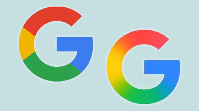
Spot the difference (Picture: Google)
If you use iPhone or Android,you might have spotted something different about the Google app.
That G in the app icon suddenly looks,ooh,smoother and oh so sleek – your eye just glides over the subtle tones,no longer the blocky purview of a toddler’s paintwork!
Well,you might have thought that. Or you might have been underwhelmed,like the users who guessed the vast sums likely spent on designers and focucs groups,and concluded they could have made a gradient blur with Word Art for much cheaper.
Whatever your view,it’s a big day for design geeks,as this is the first major update to the Google logo in almost a decade.
The last time things changed,in September 2015,they dropped their serif typeface in favor of a sans-serif look,so that really put the cat among the pigeons.
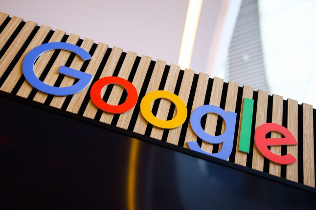
The written-out Google logo,as yet unchanged,pictured during World News Media Congress in Poland earlier this month (Picture: Getty)
They also capitalised the ‘G’ logo,in a bid to be simpler,as more and more people accessed Google on mobile phones with smaller screens.
This time,the change is thought to be to bring the logo into line with the blurred look of their Gemini ‘AI assistant’ chatbot.
The change was rolled out to iOS and Android users this week,with the latest app update which Google says includes ‘performance improvements’.
The full word Google logo has not yet changed,and nor has the Chrome logo,or the Google Maps logo.
But given they also include colour blocks… watch this space?
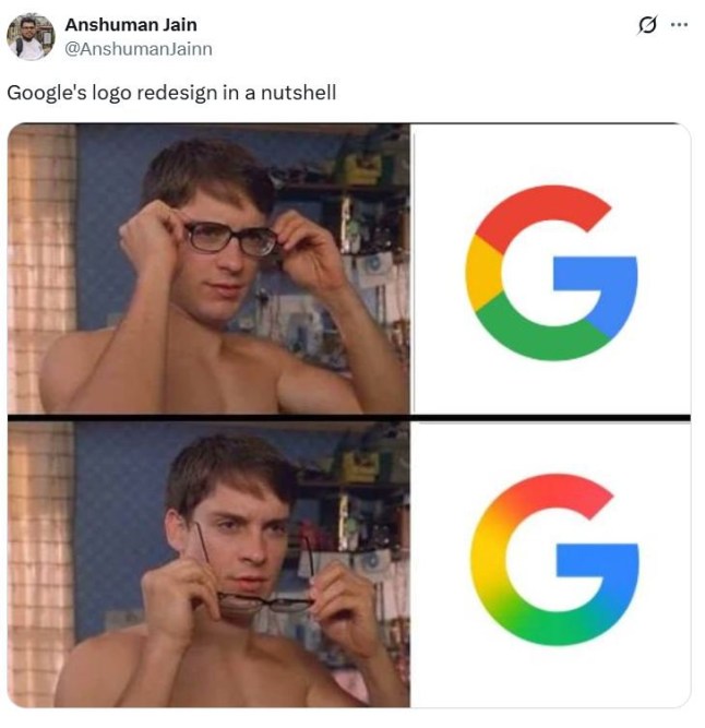
Some were not so impressed (Picture: X)
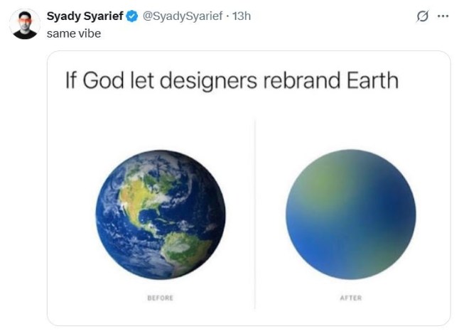
A blurry blue planet (Picture: X)
Reaction has so far been mixed,with plenty of people saying they like it,but others saying it just looks like they have taken their glasses off making everything look more blurry.
Others joked that blurring was just the go-to for everyone these days.
In 2015,Google announced their new look with a blog post explaining: ‘This isn’t the first time we’ve changed our look and it probably won’t be the last,but we think today’s update is a great reflection of all the ways Google works for you across Search,Maps,Gmail,Chrome and many others.
‘We think we’ve taken the best of Google (simple,uncluttered,colorful,friendly),and recast it not just for the Google of today,but for the Google of the future.
‘You’ll see the new design roll out across our products soon. Hope you enjoy it!’
The dolphins were seen swimming in endless circles or floating aimlessly by the gate.
Jul 7, 2026
Three people were injured in the blast in Monaco, including a 13-year-old boy.
Jul 2, 2026
The boy presented with symptoms days after he woke up with the bat lying on his face.
Jul 1, 2026
The workers of a bungee company who threw a model to her death after her safety cord was unattached have appeared in court.
Jun 16, 2026